EFFECTIVE GRAPHICAL REPRESENTATION OF DATA: CHOOSING THE RIGHT VISUALIZATIONS
Introduction
In today’s data-driven world, effectively presenting information through graphical representation has become crucial. Choosing the right visualizations is essential for conveying insights, highlighting trends, and facilitating data-driven decision-making. However, with a wide array of available visualization options, selecting the most appropriate one can be challenging. In this article, we will explore the key factors to consider when choosing visualizations and provide guidelines for creating impactful graphical representations of data.
Understanding the Data and Objectives
Before selecting a visualization method, it is essential to understand the data you are working with and the objectives you aim to achieve. Consider the type of data (numerical, categorical, or time-series), the relationships between variables, and the insights you want to communicate. This understanding forms the foundation for selecting appropriate visualizations that best represent the underlying patterns and trends.
Choosing the Right Visualizations
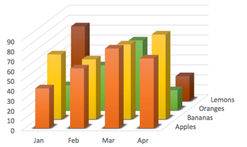
- Bar Charts and Column Charts: Bar and column charts are excellent choices for comparing categorical or discrete data. They are effective in showing the magnitude of different categories and identifying trends. Bar charts are best suited for presenting data horizontally, while column charts work well for vertical representation.
- Line Charts: Line charts are useful for displaying trends over time or continuous data. They enable easy identification of patterns, fluctuations, and correlations. Line charts are particularly effective when representing data with multiple series, allowing comparisons between different variables.
- Pie Charts: Pie charts are ideal for representing proportions and percentages. They provide a visual representation of how different categories contribute to a whole. However, it’s important to use pie charts sparingly and ensure that the data is easily understandable without ambiguity.
- Scatter Plots: Scatter plots are beneficial when exploring the relationship between two continuous variables. They reveal the correlation, clusters, or outliers in the data. Adding additional information, such as color or size, to the plot can help convey more dimensions of the data.
- Histograms: Histograms are suitable for illustrating the distribution of numerical data. They provide insights into the frequency or probability distribution of a variable. Histograms are especially useful for identifying patterns, peaks, or skewness in the data.
- Heatmaps: Heatmaps are effective for representing large amounts of data and visualizing patterns or relationships between two categorical variables. They use color gradients to encode values, making it easy to identify hotspots or clusters.
- Area Charts and Stacked Bar Charts: Area charts and stacked bar charts are useful when displaying cumulative data or comparing proportions over time. They allow for clear visualization of the contribution of different categories to the whole.
- Box Plots: Box plots are suitable for displaying the distribution and variability of numerical data. They provide information about the median, quartiles, and potential outliers. Box plots are valuable for identifying skewed distributions and comparing multiple groups simultaneously.
Considerations for Effective Graphical Representation
- Keep it simple: Avoid clutter and unnecessary embellishments. Focus on the key message you want to convey and eliminate any distractions that hinder comprehension.
- Use appropriate scales: Ensure that the scales on axes accurately represent the data and avoid distorting the information being presented. Scaling can significantly impact the interpretation of the visualizations.
- Provide context and annotations: Include relevant labels, titles, legends, and captions to provide context and aid interpretation. Annotations help in highlighting specific data points or trends, further enhancing the understanding of the information presented.
- Choose colors wisely: Select colors that are visually appealing, easy to differentiate, and accessible for color-blind individuals. Ensure that the color choices support the intended message and do not introduce confusion or bias.
- Test and iterate: Before finalizing a visualization, gather feedback and test it with the intended audience. Iterate based on the feedback received, refining the design and making adjustments as necessary.
Conclusion
Effective graphical representation of data is a vital skill in today’s data-driven landscape. By considering the type of data, objectives, and selecting the appropriate visualization method, you can create impactful visualizations that effectively communicate insights. Remember to keep the visualizations simple, use appropriate scales, provide context, and choose colors wisely. With these guidelines in mind, you can present data in a compelling and informative way, facilitating better understanding and informed decision-making.


