CONSTRUCTING AND INTERPRETING HISTOGRAMS
Constructing and Interpreting Histograms
Histograms are powerful graphical tools used in data analysis and statistics to visualize the distribution of a dataset. They provide a clear and concise representation of data by dividing it into bins and displaying the frequency or probability of values falling within each bin. Constructing and interpreting histograms is essential for gaining insights into the underlying patterns, trends, and characteristics of your data. In this article, we will explore the key steps to construct histograms and how to interpret them effectively.
1. Data Collection and Preparation
Before creating a histogram, you need to collect your data and ensure it is properly cleaned and organized. Data preparation includes removing outliers, handling missing values, and choosing an appropriate bin width. The quality of your histogram heavily depends on the quality of your data.
2. Determine the Number of Bins
One of the critical decisions in constructing a histogram is choosing the number of bins or intervals. The number of bins affects the granularity of the histogram. Too few bins can oversimplify the data, while too many bins can obscure the underlying distribution. Several methods, such as the Freedman-Diaconis rule or Sturges’ formula, can help you determine the optimal number of bins based on your data size.
3. Calculate Bin Width
The bin width defines the range of values included in each bin. It’s calculated by dividing the data range by the number of bins. A smaller bin width provides more detail but may result in a jagged histogram, while a larger bin width may smooth out the distribution but potentially hide important patterns.
4. Construct the Histogram
To create a histogram, follow these steps:
a. Divide the Data into Bins
Divide your data into the predetermined number of bins, ensuring each value belongs to one and only one bin.
b. Count the Frequency
For each bin, count the number of data points that fall within its range. This count is referred to as the frequency.
c. Normalize (Optional)
If your data has different scales or units, you may want to normalize the frequencies by dividing them by the total number of data points. This results in a probability density histogram, making it easier to compare distributions.
5. Plotting the Histogram
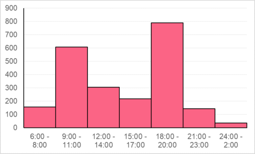
Now that you have the bin frequencies, it’s time to create the graphical representation. A histogram typically consists of bars, where the x-axis represents the bins and the y-axis represents the frequencies or probabilities. Each bar’s width corresponds to the bin width, and the height represents the frequency or probability in that bin.
6. Labeling and Styling
To make your histogram more informative, add labels to the axes, a title, and, if necessary, a legend. You can also customize colors and styles to enhance the visual appeal and clarity of your histogram.
7. Interpretation
Interpreting a histogram is key to extracting meaningful insights from your data. Here are some aspects to consider:
a. Central Tendency
Look for the center of the distribution, which can be identified by the highest bar or the peak. This provides insights into the central tendency of the data.
b. Spread
Examine the width of the distribution. A wider histogram suggests a greater spread or variability in the data, while a narrower histogram indicates less variability.
c. Skewness
Identify any skewness in the distribution. Positive skew means the tail extends to the right, while negative skew indicates a tail to the left.
d. Outliers
Check for outliers, which are data points that fall far from the central part of the distribution. Outliers can significantly impact your analysis and should be investigated further.
e. Modes
A histogram may have multiple peaks, indicating the presence of multiple modes in the data.
8. Compare Distributions
Histograms are invaluable for comparing multiple datasets or distributions. Overlaying histograms or placing them side by side allows you to visually assess differences and similarities.
Conclusion
Constructing and interpreting histograms is a fundamental skill in data analysis. They provide a visual snapshot of your data’s distribution, helping you identify patterns, outliers, and key statistics. By following the steps outlined in this article and considering the interpretation guidelines, you can harness the power of histograms to gain deeper insights into your data, make informed decisions, and communicate your findings effectively.


